Introduction
The distributions of continuous variables can be depicted in numerous ways, including through the use of histograms and box plots. The advantage of a violin plot is of combining a histogram and a box plot in the same graphic. In this blog, we’ll show you how to create a violin plot in R.
Install Package and Load Library
Let’s begin by installing and loading Indrajeet Patil’s ggstatsplot.
install.packages("ggstatsplot")
library(ggstatsplot)
Agree to installing any packages ggstatsplot recommends as being needed.
Generate the Violin Plot
Try the following R code:
ggbetweenstats(
data = iris,
x = Species,
y = Sepal.Length,
title = "Distribution of sepal length across Iris Species",
pairwise.comparisons = FALSE,
bf.message = FALSE,
results.subtitle = FALSE,
)
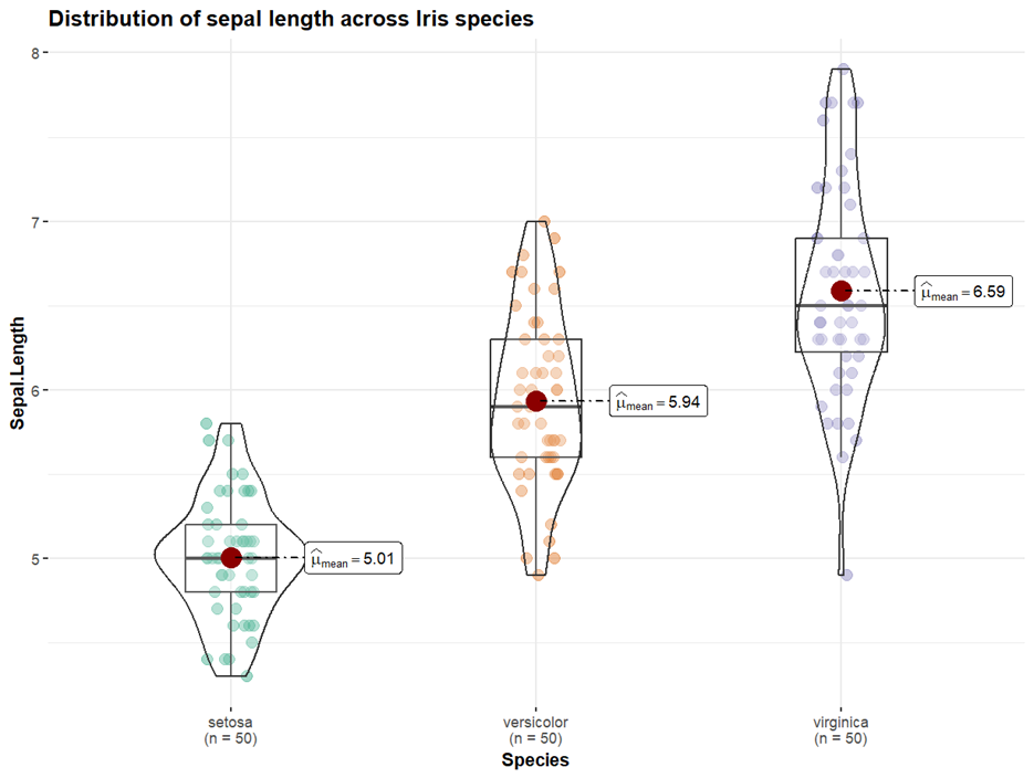
Here’s what you get:

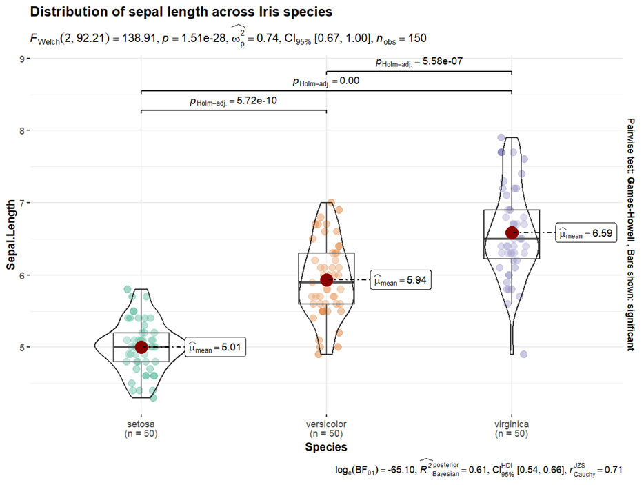
One of ggstatsplot’s distinctive features is the addition of a great deal of statistical information to plots of this kind. For example, if you try the following code, you would get inferential, descriptive, and Bayesian statistical overlays atop the violin plot:
ggbetweenstats(
data = iris,
x = Species,
y = Sepal.Length,
title = "Distribution of sepal length across Iris species"
)

If you look at the violin plot sideways, it depicts a histogram. Vertically, there is a box plot within the histogram, including the mean, interquartile range, and 95% confidence interval.
BridgeText can help you with all of your statistical analysis needs.


