Introduction
A box plot is a graphic that illustrates the distribution of a continuous variable through an interquartile range. Box plots are common graphics in academic papers, research essays, and theses that are quantitatively oriented. In this blog post, we’ll show you how to create a box plot in Stata.
Example
Let’s access a dataset in Stata that we’ll transform into a boxplot:
webuse auto
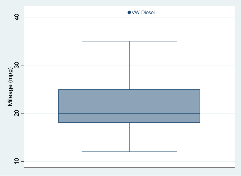
The code above will load the auto dataset that comes with Stata. Now let’s generate a box plot for miles per gallon (MPG), and, after the comma, add code that labels outliers. The mpg variable is the continuous variable whose distribution we are graphing, and make is the variable with which we want to label any outliers that are detected. Try entering the following code into the Stata command prompt:
graph box mpg, mark(1,mlab(make))

In Stata’s standard box plot, you’ll see three horizontal lines. The one on the bottom marks the 25th percentile of your distribution, the one in the middle is the median, and the one on the top marks the 75th percentile. We can label values above the 75th percentile and below the 25th percentile as outliers.
Looking at the box plot, we can see that the median MPG is right around 20. There is one outlier, the VW Diesel, which gets 41 MPG.
BridgeText can help you with all of your statistical analysis needs.


