Introduction
A histogram is the most common way to illustrate the distribution of a continuous variable. Histograms are extremely common in academic papers with a quantitative bent. In this blog, we’ll show you how to use Stata to create histograms of various kinds for your academic papers, research essays, or theses.
Creating a Dataset
Let’s create some mock data in Stata that we can use to create a histogram. Let’s generate a histogram of IQ and add the variable of college major to show you how we can further manipulate the histogram. Try the following code:
set obs 400
drawnorm a, mean(100) sd(15)
drawnorm b, mean(115) sd(20)
replace a = . in 201/400
replace b = . in 1/200
gen a_1 = round(a)
gen b_1 = round(b)
drop a b
egen iq = rowmax(a_1 b_1)
drop a_1 b_1
label var iq "IQ"
gen major = 1
replace major = 2 in 201/400
label define major 1 "History" 2 "Mathematics"
label value major major
label var major "Major"
hist iq, freq
The last line of code creates your histogram.
Basic Histogram
Here’s the histogram:
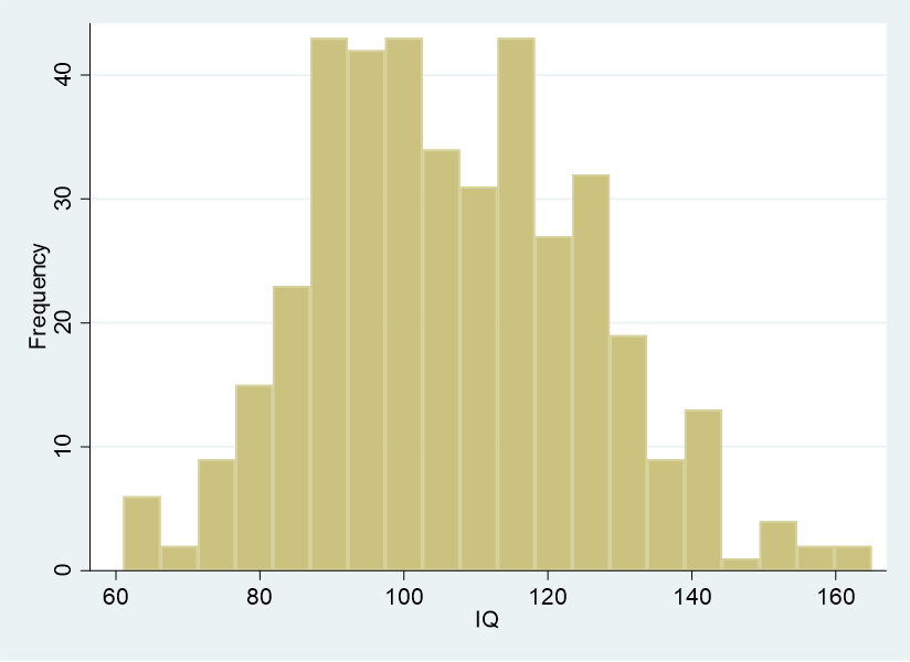
We added freq in the last line of code in order to direct the histogram to track frequency rather than density. You can try this histogram this way as well:
hist iq
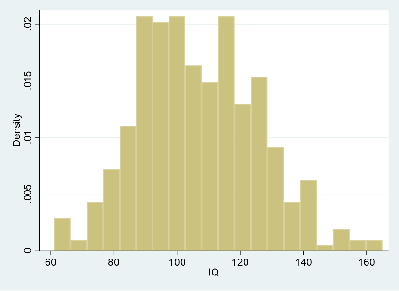
As you can see, this histogram is the same as the previous one, but the y axis tracks density. For most purposes, you will want your histograms to track frequency, so you should use the other kind of code instead:
hist iq, freq
Expand the Bins
Adding bins to a histogram captures more of the individual values on the graphic. Try the following code:
histogram iq, freq bin(40)
Here’s what you get:
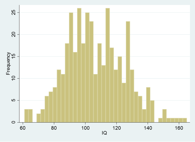
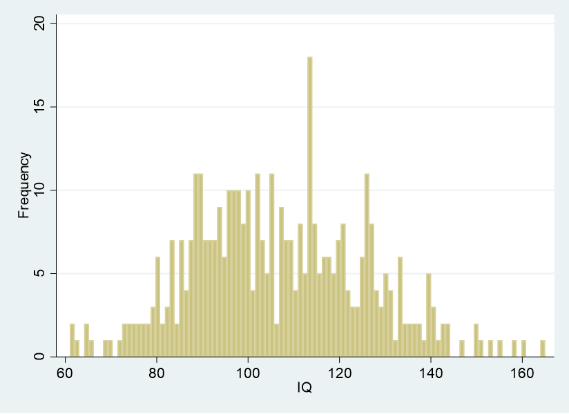
This histogram is more detailed than the previous histogram. You can experiment with specifying bin numbers in order to see what happens to your histograms in Stata. For instance, the code below will generate 100 bins for your histogram:
histogram iq, freq bin(100)
Adding Variables
In this dataset, we deliberately created two college majors, history and mathematics, under the variable name of major. The reason for doing so was to show you how you can generate separate histograms sorted by values of an independent variable. Let’s say you wanted distinct IQ histograms for history and mathematics majors. You could use the following code:
histogram iq, by(major) freq
The following histogram is generated:
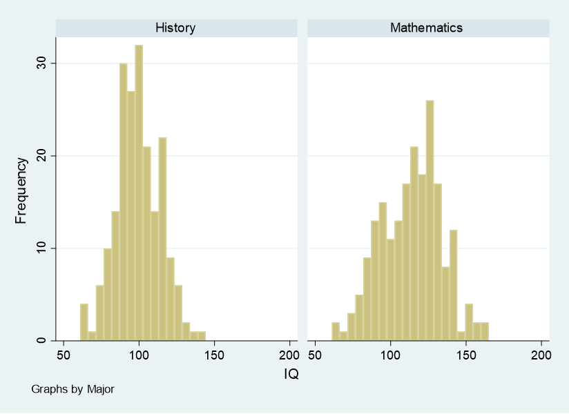
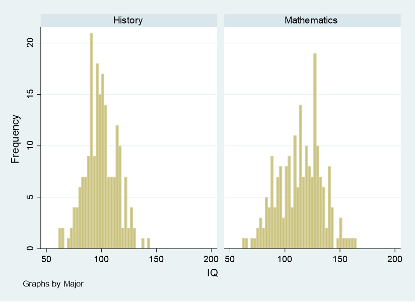
Of course, if you wanted to, you could add or subtract bins, as we showed you how to do earlier:
histogram iq, by(major) freq bin(40)
BridgeText can help you with all of your statistical analysis needs.


