Introduction
Means plots can be good alternatives to 95% confidence interval (CI) plots in contexts in which the graphical presentation of your findings needn’t possess statistical sophistication. In this blog, we’ll show you how to generate means plots in Stata.
Load Data
Let’s work with the nlsw88 dataset in data:
sysuse nlsw88
describe
Generate Means Plot
Now try the following code in Stata:
grmeanby race married collgrad, summarize(age)
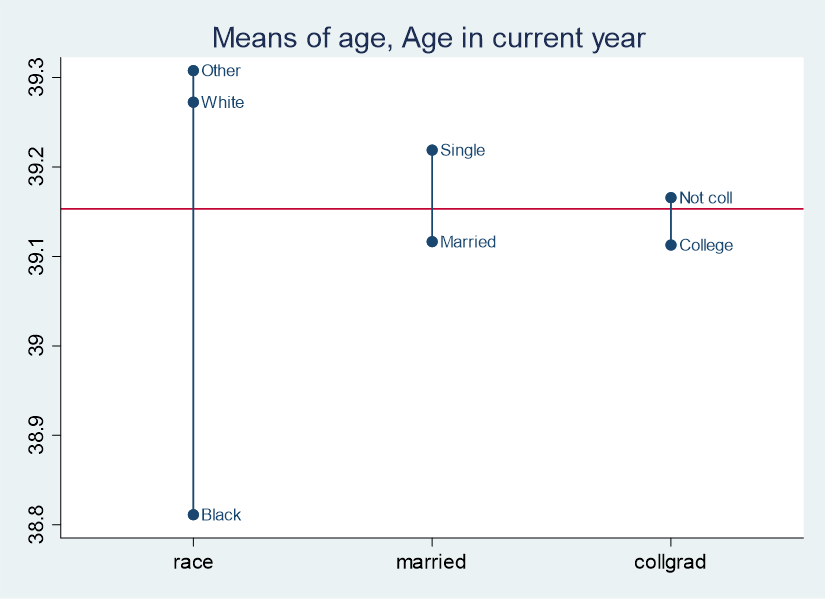
Here’s what you get:

The red line represents the mean age of the entire sample, which you can confirm as follows:
sum age
The means plot gives you the idea that White participants are older than Black participants, that single people are older than married people, and that people without college degrees are older than people with college degrees.
If you were interested in graphing the mean age by just one of these variables, race, you could try:
grmeanby race, summarize(age)

If you wanted to change the color theme of the graph, you could consult Stata documentation to learn which theme interests you and add it to the code. For example:
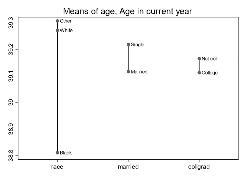
grmeanby race married collgrad, summarize(age) scheme(s1mono)
Generates the following:

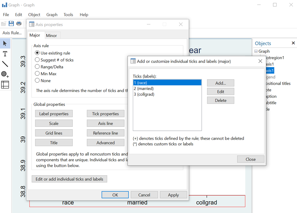
If you wanted to alter aspects of this graph, you could open the graph editor in Stata and work there. For example, let’s say you wanted sentence case for the variable names on the x axis. When the graph comes up, click on FileStart Graph Editor-->. Then click close to the x axis in the graph. The axis properties dialog box comes up. Then click on “Edit or add individual ticks and labels,” and, as you can see, you can change each label to your liking:

BridgeText can help you with all of your statistical analysis needs.


