Introduction
You’re probably familiar with a typical Cartesian (x, y) approach to graphing. However, a polar axis is typically more appropriate when working with periodic data. In this blog, we’ll show you how to use a polar axis in R.
Install Libraries
Make sure to have the following R libraries already installed.
install.packages("ggplot")
Create Data
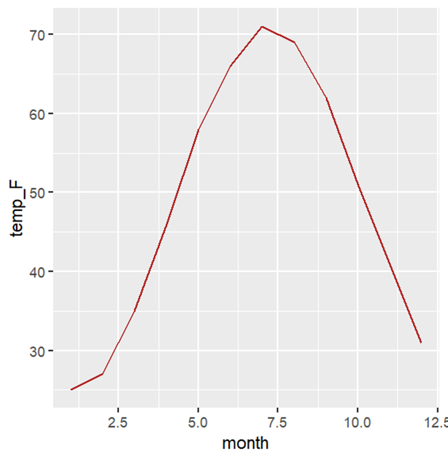
Let’s create data pertaining to the average monthly temperatures in Ithaca, New York:
Ithaca_weather <- data.frame(month = 1:12,
temp_F = c(25, 27, 35, 46, 58, 66, 71, 69, 62, 51, 41, 31))
Generate Line Plot
Start with the following:
library(ggplot2)
ggplot(Ithaca_weather, aes(month, temp_F)) +
geom_line(col="firebrick")
Here’s what you get:

Generate Polar Axis Plot
Now try adding coord_polar to the end of your previous code, as follows:
ggplot(Ithaca_weather, aes(month, temp_F)) +
geom_line(col="firebrick") +
coord_polar()
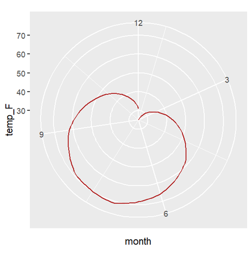
Here’s what you get:

The polar version of the graph is, in a sense, more accurate, as you can see the similarity in mean temperature between December and January, which are successive months.
BridgeText can help you with all of your statistical analysis needs.


