Introduction
A dot plot can be a simpler alternative to a 95% confidence interval (CI) plot. In this blog, we’ll show you how to create a dot plot and integrate it with a one-sample t test in R.
Install Package and Load Library
Let’s begin by installing and loading Indrajeet Patil’s ggstatsplot.
install.packages("ggstatsplot")
library(ggstatsplot)
Agree to installing any packages ggstatsplot recommends as being needed. Also, type in the following R code:
install.packages("gapminder")
library(gapminder)
install.packages("dplyr")
library(dplyr)
Generate the Dot Plot and Run the T Test
A one-sample t test is used when you want to compare the mean of a single variable to some hypothesized mean. Let’s look at the gapminder data to determine what a one-sample t test could be used for:
head(gapminder)

These are life expectancy data sorted by country, continent, and year. What we’ll do next is generate a dot plot and integrate it with a one-sample t test, which is a useful function of ggstatsplot package in R. Try the following R code:
ggdotplotstats(
data = dplyr::filter(gapminder::gapminder, continent == "Europe"),
y = country,
x = lifeExp,
test.value = 60,
type = "robust",
title = "Distribution of life expectancy in Europe",
xlab = "Life expectancy"
)
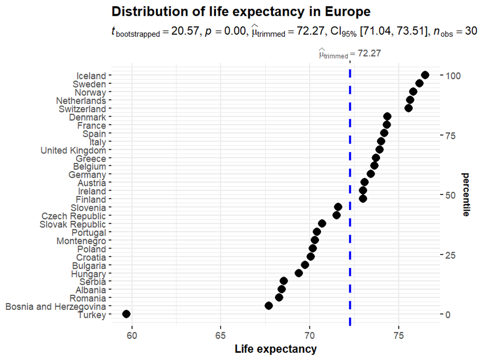
Here’s what you get:

The dot plot gives you mean life expectancies for every European country in the dataset, the vertical blue line gives you the sample mean (here, 72.27 years), and the results of the t test at the top indicate that this mean life expectancy of 72.27 is significantly different from the hypothesized value of 60. Another option for presenting these data would be through a 95% CI plot.
BridgeText can help you with all of your statistical analysis needs.


