Introduction
Stata offers a lot of color options in its graphics. In this blog, we’ll introduce you to some of Stata’s color schemes and show you how to manipulate individual colors within a graphic.
Load Data
Let’s load the built-in auto dataset and start generating our graphics.
sysuse auto
Schemes
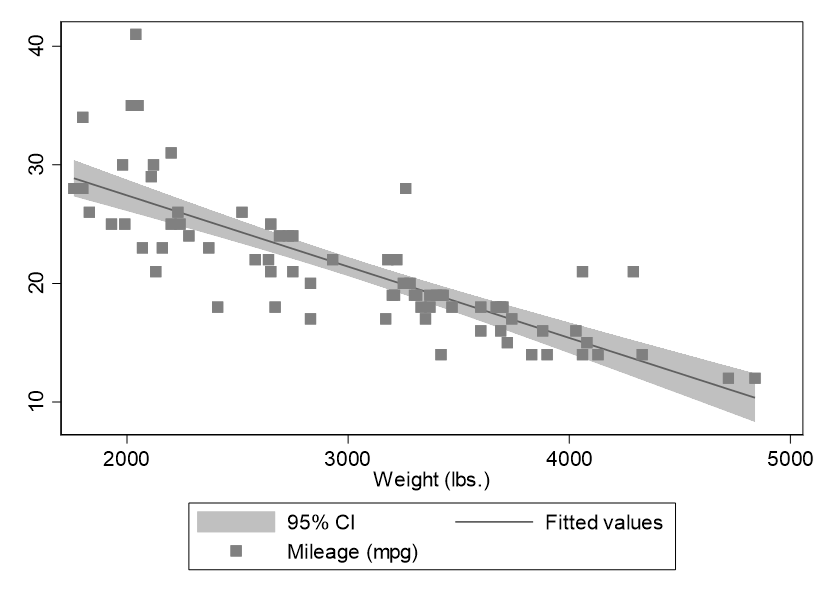
Stata has about a dozen built-in color schemes. If your paper, thesis, or essay is in APA format, you will be particularly interested in s1mono:
graph twoway (lfitci mpg weight) (scatter mpg weight), scheme(s1mono)
Generates the following:

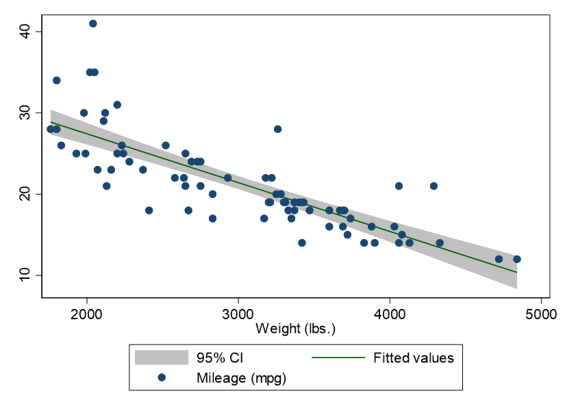
In APA format, the less color, the better. However, if you would like color, a good option is as follows:
graph twoway (lfitci mpg weight) (scatter mpg weight), scheme(s1color)

If you want different color schemes, take a look at Stata’s manual entry on this topic and enter your selected scheme name using the code approaches outlined above.
Open the Graph Editor
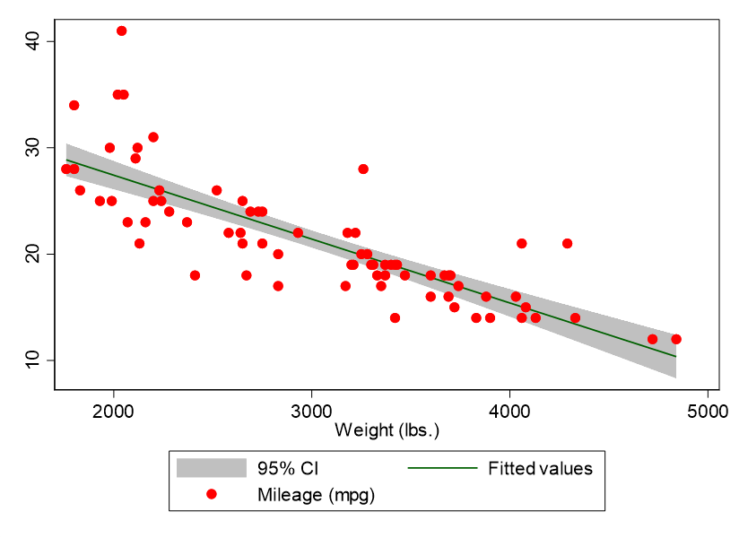
Once you generate a graphic using code or the graphical user interface, you can also click within the graphic to open up Stata’s graph editor, which you can use to make customized changes to colors. For example, using the graph editor, if you click on the data points in the s1color graph above, you can select a new color for them. Below, the data points have been turned red:

Stata offers you a great deal of color control over every graphical element from within graph editor, so be sure to explore it.
BridgeText can help you with all of your statistical analysis needs.


